Blue furniture has emerged as one of the most versatile and appealing choices for living rooms, offering everything from calm coastal vibes to bold contemporary statements. Unlike neutral grays and beiges that dominate the market, blue pieces bring personality and depth without overwhelming a space. Whether it’s a modern blue sofa living room setup or accent chairs in navy velvet, blue works across design styles, from farmhouse to mid-century modern. This guide walks through selecting the right shades, choosing anchor pieces, and building color palettes that let blue furniture shine without turning your living room into a themed showroom.
Table of Contents
ToggleKey Takeaways
- Blue furniture for living rooms combines visual interest with psychological calming effects, making it ideal for spaces where families relax while maintaining long-term design relevance across decades.
- Light blues create spacious, coastal vibes perfect for smaller rooms, while navy and deep blues provide sophisticated anchor points for larger spaces—choose undertones based on your room’s natural lighting and existing décor.
- Start with one substantial blue furniture piece (sofa, sectional, or accent chairs) and build outward; avoid over-committing to ensure flexibility as design preferences evolve.
- Use the 60-30-10 color ratio with neutral walls (60%), blue upholstery (30%), and warm accent colors like brass or coral (10%) to create balanced, cohesive living room designs.
- Tested color palettes like blue with white and natural wood, or navy with cognac and brass, provide proven styling frameworks that ensure your blue living room furniture complements rather than competes with other elements.
- Maintain blue upholstery by rotating cushions regularly, vacuuming monthly, and following fabric cleaning codes to preserve color vibrancy and prevent permanent damage.
Why Blue Furniture Works Beautifully in Living Rooms
Blue sits in a sweet spot on the color spectrum, it’s visually interesting but psychologically calming. Research in color psychology consistently shows that blue tones reduce stress and promote relaxation, making them ideal for spaces where families gather and unwind.
From a design perspective, blue functions almost like a neutral. It pairs cleanly with warm woods, metals (brass, chrome, or matte black), and both warm and cool accent colors. A cobalt blue accent chair can ground a room full of white walls and light oak flooring, while a dusty blue sectional softens industrial spaces with exposed brick and steel beams.
Blue also handles natural light exceptionally well. In north-facing rooms with cooler light, warmer blues (those with gray or green undertones) prevent the space from feeling cold. In bright, south-facing rooms, crisp blues stay vibrant without fading visually under strong sunlight.
One practical advantage: blue upholstery often hides minor wear better than lighter neutrals. Fabrics in medium to deep blues show fewer shadows from body oils and don’t highlight every speck of dust the way cream or white upholstery does. For households with kids or pets, that’s a meaningful durability factor.
Finally, blue furniture offers longevity. Unlike trendy colors that date quickly, blue has appeared in furniture design across decades, from the saturated hues of Art Deco pieces to the muted tones popular in Scandinavian design. Investing in a quality blue piece means it won’t look out of place when design trends shift in five years.
Choosing the Right Shade of Blue for Your Living Room Furniture
Not all blues behave the same in a living room. The shade you choose affects mood, spatial perception, and how easily the piece integrates with existing décor. Here’s how to match blue tones to your goals.
Light Blues for Airy, Coastal Vibes
Powder blue, sky blue, and seafoam work best in spaces aiming for a relaxed, open feel. These shades reflect light rather than absorb it, making smaller living rooms feel more spacious. They’re naturals for coastal or cottage styles but also fit into modern farmhouse and Scandinavian schemes.
When selecting light blue upholstery, pay attention to undertones. Blues with gray undertones (sometimes called “dusty blue”) read more sophisticated and less juvenile than pure pastels. They’re easier to style with neutrals and metallics.
Light blues show dirt more readily than darker shades, so fabric choice matters. Performance fabrics, polyester blends treated with stain-resistant finishes, are worth the upcharge if you’re concerned about maintenance. Alternatively, removable, washable slipcovers give you flexibility.
Pair light blue furniture with warm-toned woods (oak, walnut, teak) to prevent the room from feeling cold. Brass or gold accents add warmth, while chrome and silver lean into a cooler, more contemporary palette. Studies on colorful furniture placement show that balancing cool tones with warm textures creates visual harmony.
Navy and Deep Blues for Sophisticated Elegance
Navy, midnight blue, and indigo bring weight and formality. These shades anchor a room, making them ideal for large sectionals, statement sofas, or oversized armchairs. Deep blues work particularly well in contemporary, traditional, and transitional living rooms where a sense of gravitas is appropriate.
Navy upholstery reads almost as a neutral, it pairs as easily with white trim and light walls as charcoal or black would, but with more visual interest. In rooms with high ceilings or abundant natural light, deep blue furniture adds definition without shrinking the space.
Fabric texture becomes more visible in dark blues. Velvet creates a luxe, slightly moody look: linen offers texture and casual sophistication: leather (or faux leather) skews modern or masculine depending on the furniture silhouette.
One structural consideration: deep blue furniture can disappear in dim lighting. If your living room relies heavily on ambient or mood lighting in the evenings, add task lighting (floor lamps, picture lights) to keep the piece visually present. Otherwise, that expensive navy sectional fades into the shadows.
Best Blue Furniture Pieces to Anchor Your Living Room
Choosing the right blue furniture piece depends on room size, layout, and how much commitment you’re ready for. Here’s a breakdown of high-impact options.
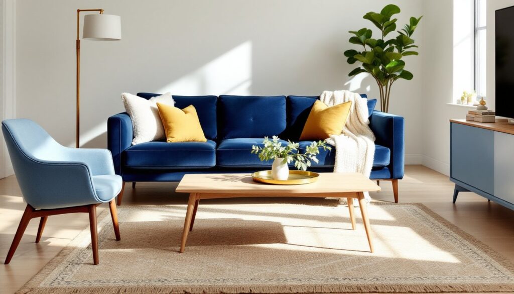
Sofas and sectionals are the biggest investments and the most dominant visual elements. A modern blue sofa living room setup typically features clean lines, low profiles, and legs that lift the piece off the floor, this maintains an airy feel even with bold color. For sectionals, L-shaped configurations work in most layouts, but U-shaped sectionals in blue require significant square footage (plan for at least 14 × 16 feet of usable space) to avoid overwhelming the room.
When shopping, check frame construction. Kiln-dried hardwood frames (oak, maple, or birch) offer the best longevity. Avoid softwood or engineered wood frames on pieces you plan to keep for more than five years. Cushion fill matters, too, high-density foam (minimum 1.8 lb/ft³) holds shape better than polyester fiberfill.
Accent chairs offer a lower-commitment entry point. A pair of navy wingback chairs flanking a fireplace or a single cobalt blue mid-century armchair in a corner adds color without dominating. Accent chairs are easier to move or replace if tastes change, and they’re simpler to reupholster than a full sofa.
Ottomans and benches in blue function as both seating and coffee table alternatives. A large upholstered ottoman (36 × 36 inches or bigger) can serve as a central focal point in casual family rooms. Add a tray on top for drinks and remotes. Smaller blue benches work well in entryways or at the foot of a sectional for extra perching space.
Storage pieces, like blue media consoles, sideboards, or credenzas, bring color at a different height plane, which adds visual interest. Painted wood pieces in matte or satin finishes (not high-gloss, which can look juvenile) fit into furniture-focused design schemes that layer multiple finish types.
Avoid over-committing early. Start with one substantial blue piece and build from there. Adding a second blue element (pillows, throws, artwork) is easy. Removing or replacing a massive blue sectional because you went too bold is expensive and labor-intensive.
Styling Tips: How to Design Around Blue Furniture
Blue furniture works best when the rest of the room supports it without competing. Here’s how to build a cohesive space.
Start with neutrals as your base. White, cream, gray, and taupe walls let blue furniture stand out. If you prefer darker walls, charcoal or greige (gray-beige) creates drama without clashing. Avoid painting walls the same shade as your furniture, it flattens the room and kills contrast.
Layer textures, not colors. When you have a bold furniture color, variety in texture adds depth without visual chaos. Pair a smooth velvet blue sofa with a chunky knit throw, linen pillows, a jute rug, and a wooden coffee table. Each material catches light differently, creating richness.
Use the 60-30-10 rule. Designers rely on this ratio for balanced color distribution: 60% dominant color (walls, large rugs), 30% secondary color (upholstery, curtains), 10% accent color (pillows, art, accessories). If your blue sofa represents the 30%, keep walls neutral (60%) and accent with warm metals or coral tones (10%).
Anchor with a rug. A rug that incorporates your blue furniture shade plus two or three other colors simplifies styling. Pull accent pillow colors from the rug pattern, and suddenly everything looks intentional. Aim for a rug large enough that at least the front legs of all seating rest on it, 8 × 10 feet minimum for most living rooms.
Mind the undertones. Blue furniture with green undertones (teal, turquoise) pairs well with warm woods and earthy tones. Blue with purple undertones (periwinkle, lavender-blue) works with cooler grays and silvers. Mixing undertones, like pairing a teal sofa with cool gray walls, can look muddled. Test paint samples and fabric swatches together in your actual lighting before committing.
Don’t forget metallics. Brass and gold warm up blue beautifully, especially navy and deep blues. Chrome, nickel, and black metals suit lighter blues and modern aesthetics. Mix metal finishes sparingly, two is harmonious, four starts looking cluttered.
Consider inspiration from contemporary furniture layouts that emphasize spatial balance and material diversity.
Color Palettes That Complement Blue Living Room Furniture
Blue is cooperative, but some color pairings create magic while others fall flat. Here are tested palettes.
Blue + White + Natural Wood: Classic and foolproof. Crisp white walls, a blue sofa, and warm oak or walnut accents create a fresh, timeless look. Add texture through woven baskets, linen curtains, and ceramic vases. This palette suits coastal, Scandinavian, and modern farmhouse styles. It’s airy without feeling stark.
Blue + Gray + Mustard: Sophisticated and current. Pair a slate blue sectional with light gray walls and mustard yellow accent pillows, throws, or a single armchair. The warm yellow prevents the cool tones from feeling sterile. This works well in urban apartments and contemporary homes. Keep mustard to about 10-15% of the palette, too much overwhelms.
Blue + Cream + Coral: Soft and inviting. Dusty blue furniture with cream walls and coral accents (pillows, artwork, a single painted side table) feels feminine without being overly sweet. This palette fits transitional and cottage styles. Use matte finishes on coral elements to keep it grounded.
Navy + Cognac + Brass: Rich and layered. A navy sofa, cognac leather armchairs or ottoman, and brass light fixtures and hardware create a high-end, library-like feel. Dark stained woods (walnut, mahogany) reinforce the warmth. This palette suits traditional, transitional, and masculine-leaning spaces. It requires good lighting to prevent it from feeling cave-like.
Blue + Blush + Gold: Elegant and trend-aware. Light blue or periwinkle furniture with blush pink accents and brushed gold metallics reads current and polished. This combination works best in well-lit rooms with white or light gray walls. It’s popular in modern design circles for its balance of softness and sophistication.
Blue + Green + Cream: Organic and calming. Pair blue furniture with sage green pillows, potted plants, and cream or off-white walls. This palette brings the outdoors in and suits spaces with good natural light and a connection to gardens or views. Use real plants, not faux, they enhance the authenticity.
Monochromatic Blue: Bold but risky. Layering multiple shades of blue (navy sofa, powder blue pillows, teal rug) creates depth if done carefully. Vary the tones (light, medium, dark) and textures (smooth, nubby, shiny). This approach works best in modern or eclectic spaces and requires confidence. If you’re uncertain, bring in a neutral or warm accent to break it up.
When testing palettes, gather physical samples, paint chips, fabric swatches, wood samples, and view them together in your room’s actual lighting at different times of day. Digital mockups rarely capture how colors interact under your specific conditions. Many homeowners benefit from exploring essential furniture pairings before finalizing color schemes.
One final note: Blue furniture is forgiving, but it’s not indestructible. Rotate cushions every few weeks to even out wear and fading. Vacuum upholstery monthly with a soft brush attachment. For fabric pieces, check the cleaning code (W for water-based cleaner, S for solvent-based, SW for either, X for vacuum only) and follow it. Ignoring the code can set stains permanently or damage fabric.